Summary | Considerations
The Standley Lake Library project, was a UI/UX school project intended to improve the user experience of patrons at a local library of your choice. A brand identity system was necessary in order to implement my main idea/solution. My primary objective with this project was to create something the library could feasibly offer to patrons, that wasn’t readily available online. The public library system is having a difficult time keeping up in an age of technology based convenience.
Cost | Budget | Printing
Classes must be diverse, interesting, and inviting
The program must promote a sense of community and learning
Feasibility with implementing ALP classes
One Site Research
On site research was a primary source of observation in order to overhaul user experience at the library. The library was sufficiently cleaned and operated well for what it offered. Beyond basic computer services and book checkout the library lacked many forms of engagement with the local community. Talking with patrons made it abundantly clear that much of what a library offers is highly accessible via phone, laptop, or online video hosting service.
Branding was necessary to implement new programs or initiatives
Classes that were present were outdated
Branding would support both research and solutions
Significant lack of Patrons

Learning in any capacity
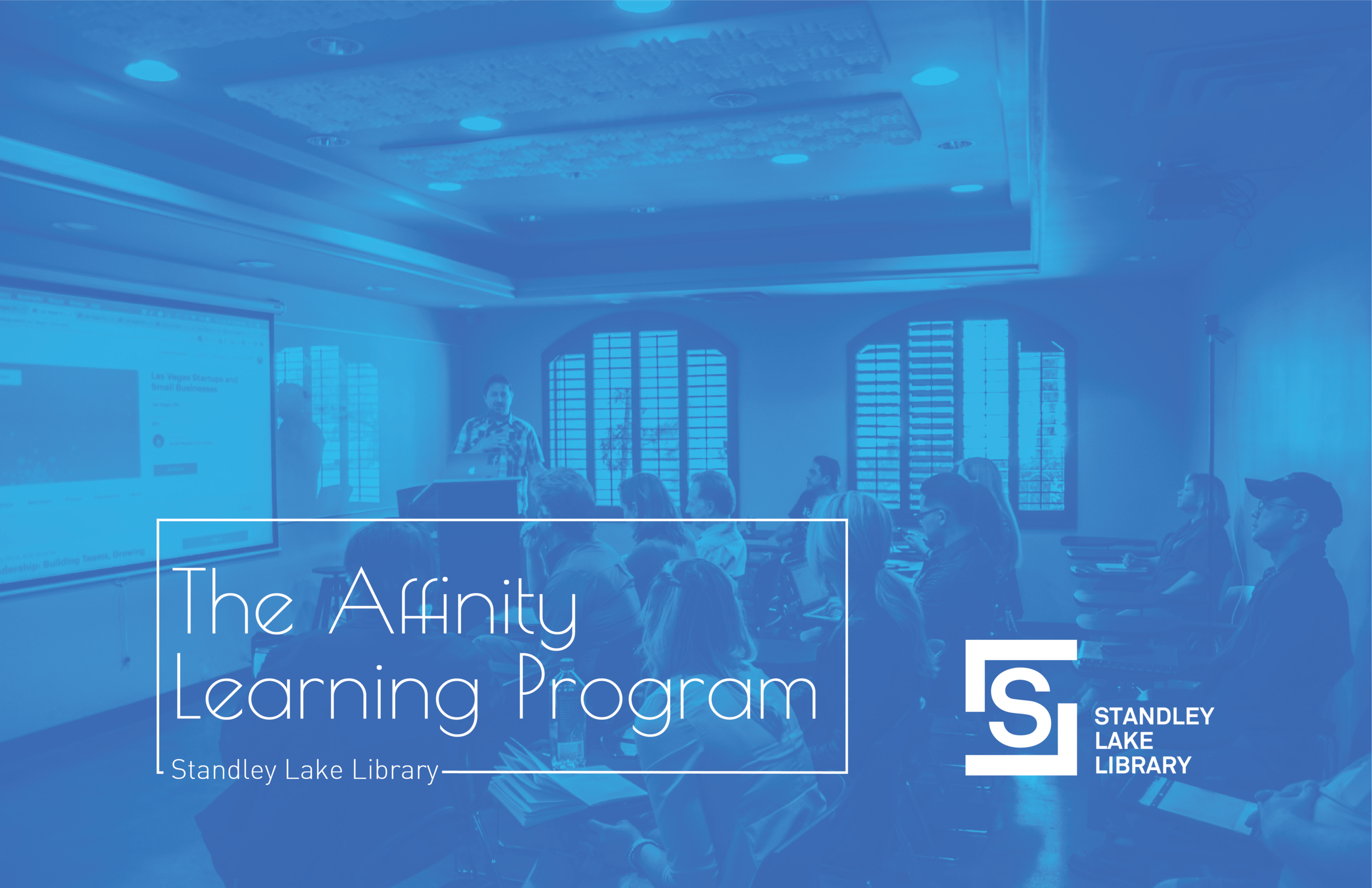
What the Affinity Learning Program (ALP) offers to the Standley Lake Library and indeed all libraries is a program that is based completely around learning in a multitude of ways. The public library system limits learning to books, basic art classes, and office management programs.
The ALP program would be an all volunteer program in which professionals from all sections of employment would teach their skills to an audience at the Standley Lake Library for free. By utilizing many free resources from the community the program could run at little to no cost to the library. The ALP program could engage with a host of new patrons, while offering something that is not a readily available to them.
The program would feel like a private lesson in a wide array of areas. The program is seemingly endless in the ways it could teach and engage with the local community.
Graphic Design
Guitar
Singing
Photography
Magic
Storytelling
Writing
Poetry
Branding for Standley Lake and the ALP program
Logo
A strong logo was needed for the library in order to separate it from every other library in Jefferson county. Using letters as patterns and textures, the logo created itself organically through experimentation for page backgrounds.
Icons
On site research yielded that there was very little use of iconograhpy. The library would heavily benefit from this aspect of branding. Its also more visually stimulating.

Pattern
As with every branding project patterns are very necessary in order to create visual intrigue and break up the metonymy within presentations, collateral, and web design. I decided to use a series of hexagons and sometimes large letter forms within the chosen color palette to break up the compositions.


Color
I wanted the color palette for this project to be soothing and and supportive of a quiet environment. The blues are the stars of the shows that are supported and contrasted with the grayscale colors in order to have a large range of uses and different choices for colors.

Type
The type needed to be engaging and subtle to allow for the photography and literal content of the text to speak out about all else. There was lot of inspiration from magazine covers, old motivational posters and concert posters as well.

Where it lives
I imagine the collateral for Standley lake Library existing in every part of the library. Research dictated that not only was there a lack of identity, but a lack of promotion for anything they offer. Banners, standing signs, posters, and kiosks lets get this place relevant.
Services, classes, and events were limited to a bulletin board and their website. Under utilizing the libraries resources is a detriment for the user and the staff. Every single employee present was polite and wanting to help.

Collateral | Promotion

Kiosk
As a way of further improving the user experience of the patrons and means of communicating the libraries offerings an interactive kiosk would be implemented. The Kiosk would feature an easy way for patrons to see classes, events, and or simply look up a book.

Kiosk Walkthrough
This quick kiosk walkthrough was prototyped in Adobe XD to demonstrate the functionality, brand identity, and implementation for the Standley Lake Library.

