Summary
The Pasty Republic is a Denver based restaurant that exclusively sells pasties. When I first started this project, I found that The Pasty Republic was in need of a singular identity that captured the quality, care, and potential of their brand.
Deliverables
Logo’s | Variants
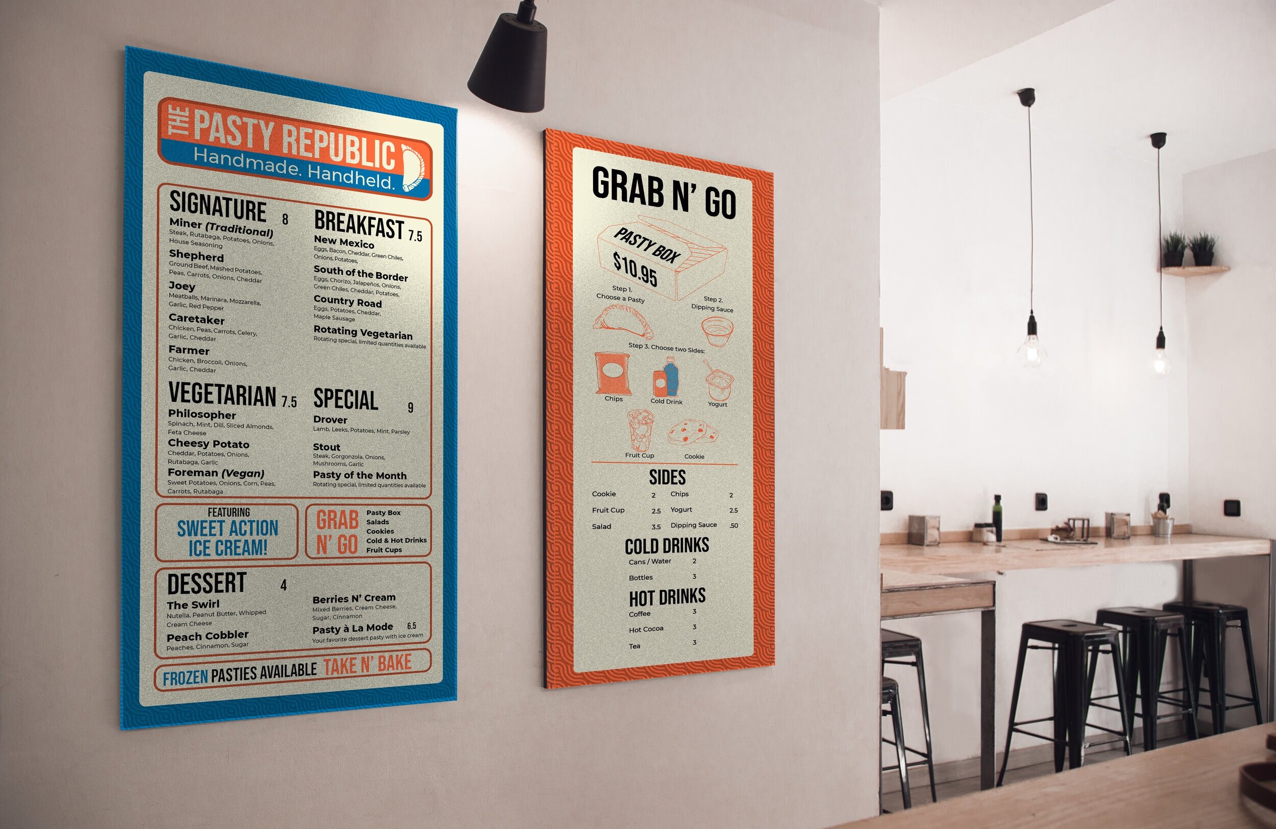
Menu’s | A-frame | Leaflets | Outdoor | Indoor
Business Card | Punch Card
Sticker | Stamp
Brand Identity
Color
Font Choice
Grid
Illustration


STRATEGY
Establishing the illustration, colors, and type had to meet many expectations and objectives. Highly legible fonts, size, and contrast were all qualities the signage had to have in order to be more effective for the customers. Originally the colors weren’t as friendly or inviting as they are now. As the project continued to be refined, I finally found the color palette that was right for The Pasty Republic. The Typography was so essential and I was fortunate enough to have find a nice pairing early on.
CRITERIA
Colors needed to be kind, cheerful, and inviting
Design elements had to fit both a vintage and modern aesthetic
Type must be visible and legible to every patron
Logos
The Golden Girl
This version of the TPR logo is used in many situations and often yields itself to a lot more use due to the versatility of the circular composition. Business cards, punch cards, leaflets, stamps, and stickers used this logo.

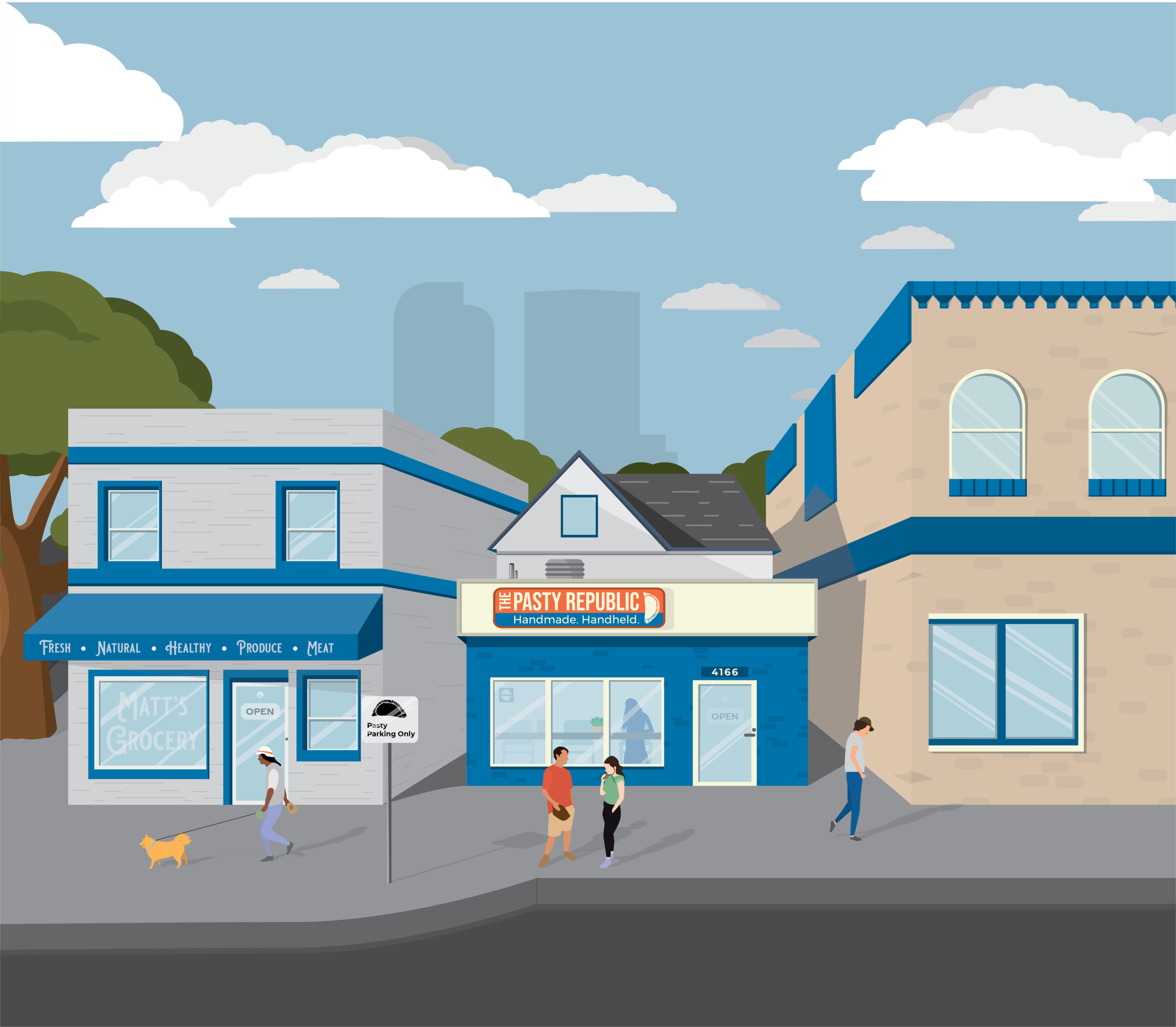
The Cadillac
Often used in the menu layouts for TPR it helped fill in the spaces and quickly established a hierarchy. It’s used as the primary logo for the outside sign currently on both buildings.